

I'll be honest: before researching this post, audio description was the accessibility standard I knew the least about. I understood captions for deaf users - that's straightforward. But audio description? I knew it existed, but had never actually implemented it or really understood when it was necessary.
Drupal Planet
Orientation and Reflow
Picture someone with a tablet mounted on their wheelchair in landscape orientation. They navigate to your site, but it forces portrait mode, making it impossible to use without physically rotating their mounted device - something they can't easily do. Or imagine someone with low vision zooming their browser to 400%, only to find they now have to scroll horizontally to read every single line of text.

Non-text Content
If you know anything about web accessibility, you probably know about alt text. It's the most widely recognized accessibility technique - that little text description you add to images so screen readers can announce what the image shows. But there's more to non-text content accessibility than just slapping some alt text on every image and calling it done.
Let's dig into what you might not know about making images, icons, charts, and other non-text content accessible.
Content on Hover or Focus
You hover over an icon to see what it does, and a helpful tooltip appears. But before you finish reading it, you accidentally move your mouse slightly and the tooltip vanishes. Or you're using a screen magnifier and the tooltip appears, but it's positioned right under your mouse pointer, making it impossible to read the magnified version. Or you're navigating with a keyboard, the tooltip appears when you tab to a button, but you can't move your mouse over the tooltip text to select and copy it.
Error Prevention
Imagine clicking "Submit" on a legal contract, only to realize you meant to click "Save Draft." Or transferring $1,000 to the wrong account with no confirmation step. Or deleting your entire photo library with a single misclick. These aren't hypothetical scenarios - they happen every day when websites don't implement proper error prevention.
Status Messages
You click "Add to Cart" and a little notification pops up: "Item added!" You submit a form and see "Thank you, your message has been sent." You start typing in a search box and results appear below as you type. These instant feedback messages are everywhere on modern websites - but are they accessible to everyone?
For sighted users, these visual cues are obvious. But for someone using a screen reader, these dynamic updates can be completely invisible unless they're coded properly. The page content changed, but their screen reader said nothing about it.
Resize Text
Picture this: you're reading an article on your phone, or maybe you're at your desktop after a long day of staring at screens. The text is just a bit too small, making your eyes work harder than they should. You zoom in... and suddenly half the content disappears off the side of the screen, or worse - text overlaps and becomes completely unreadable.
Focus Order and Visibility
Have you ever tried to fill out a form on a website using only your keyboard? Maybe your mouse died, or you're working on a laptop with a finicky trackpad. You hit Tab to move from field to field, and suddenly you're jumping all over the page, or worse - you have no idea which field you're actually in.
This is the daily reality for many keyboard-only users, including people who use screen readers, people with motor disabilities who rely on keyboard navigation, and power users who simply prefer keyboard shortcuts for efficiency.
Headers and Labels
So much of accessibility is about making your content clear and understandable to a wide range of users. Structuring your content can really help here. Adding headings for each section of text particularly helps with assistive technologies like screen readers. Headers can help organize your content into groups, and show the relationships within your content.
Multiple Ways
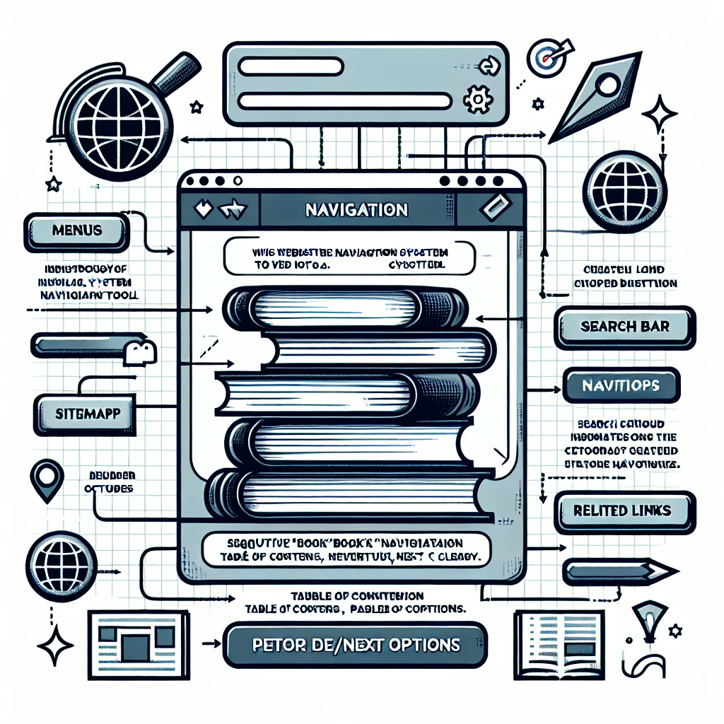
If you have a lot of content, finding something specific can be a challenge for your users. For accessibility, this guideline was created to support people that have different ways of thinking or finding things -- but I find this useful in all sorts of contexts. Strong navigation implies structure on your site, structure that can help people find what they are after.
Contrast Issues
One of the most common issues we run into making websites accessible is contrast -- making sure the difference between the color and brightness of the text against the background is enough that it's clearly readable.
Blue text on a dark background can be very difficult to read -- but it's not just brightness. Red-green color-blindness affects around 8% of males around the world. Take a screen out into bright sunlight and try to read text that's similar brightness to its background, and you can start to understand that contrast issues affect everyone.

🕑Nov 20, 2025 🖋John Locke
💬0
Vibe-coding versus Open Source - Security over the long haul
Vibe-coding is all the rage today. Who needs a developer when you can get an AI to develop an application for you? There are scads of application development tools now that promise to create that app you always wanted -- and surprisingly, these often work!
