It's great to boil down information into simple bite-sized chunks. But for so many kinds of information, it's just not that simple. Ecological systems. Policy decisions. Your body. Your website. Health is a complex system with a lot of different interrelated components, and while it may be easy to focus on a particular aspect, understanding the larger whole can be challenging. And expressing that whole on a website? Walls of scary text, detailed lists, all sorts of information that tend to scare users away.
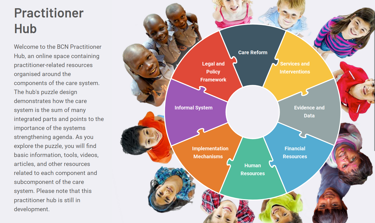
This is the problem that Better Care Network (BCN) brought to Freelock - 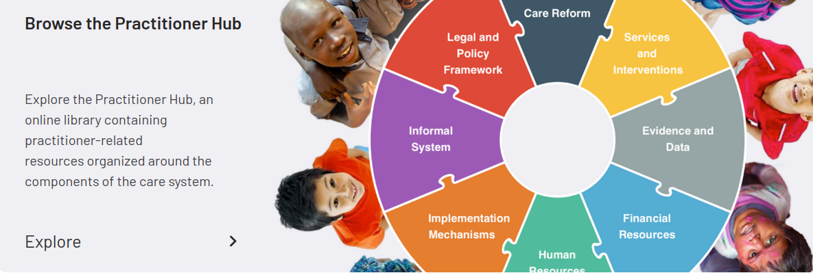 organize their extensive library of resources, studies, and reports centered around care systems for countries around the world into a visual representation that provides their audience with a mental model of all the different factors and practices around their work.
We immediately brought in our friends at Culture Foundry to design the visual experience for end users, while we focused on the editorial side of how to highlight and present resources from their 12,000+ item collection, and make it easy for them to keep it current going forward. And thus, the "Puzzle Project" came to life!
Breaking down the problem -- how to organize the information
We did not create a new website. BCN already had a Drupal site (Drupal 8 at the time, since then updated to 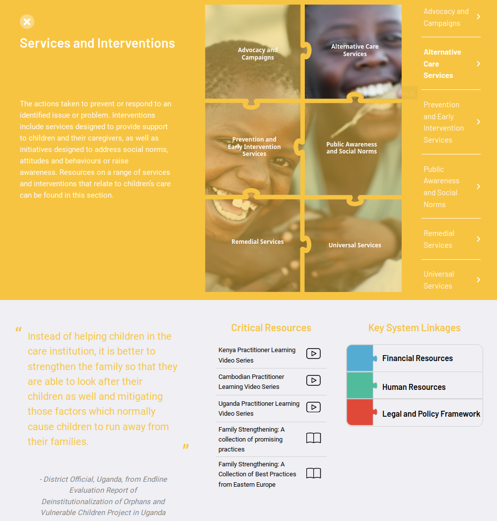 Drupal 9), and it was full of great information -- but their visitors couldn't easily find what they needed, especially for one of their key target audiences, new practitioners in countries around the world looking for resources and best practices. Search was a major component on their site, but if you don't know what to search for, it can be really hard to find.
The information they wanted to present did break down into a relatively straightforward hierarchy. At the top level, they had 8 main topics. Underneath each topic they had defined subcategories further organizing their information. And some of those subcategories had additional layers.
Now, these could have been built as individual pages on the site. And, in fact, they are individual pages that search engines can find and index. Because there was a clear hierarchy, and different page templates for the top level, the category page, and the subcategory page (where people find the actual resources), we chose to implement the structure as a Drupal Taxonomy.
The best thing about Drupal is how easy it is to enhance and change existing sites. We could easily add the new taxonomy and create fields so that editors could select a color, photo, a quote, and related topics for each category. With this in place, the site editors built out the structure of topics, and could start tagging their existing resources on their live site long before we actually launched the puzzle.
Progressive Enhancements bring new life to an existing site
We are seeing a big rise in "Headless" sites built using new front-end frameworks like React or Vue.js. These sites often incorporate animations, smooth transitions, and other techniques that make them "feel" much more modern. Not only that, but they also can load content in more dynamic ways, leading to an entirely new experience on the web.
 Headless sites flip how websites work. Instead of browsing from one page to another, with the web server sending entire pages to the browser each time you click a link, with a headless site your browser loads up a program that simply fetches new content from the server and fills in the parts of the page that change. Once the site is loaded, new page views can have animated transitions
But headless sites are expensive, and usually make it much harder for editors and site administrators to update content without the assistance of a developer. If your content is getting constantly updated, it's hard to beat a content management system like Drupal or WordPress for the editorial experience.
The good news? If you already have Drupal or WordPress, you don't need a new site to be able to take advantage of all the possibilities of a headless site -- both of these platforms can be a great back end for a fully headless site. Or, you can select parts of your site to make headless, while leaving other parts of the site alone.
This is the choice BCN made -- to add a unique experience to guide users to relevant content on top of their existing site.
The Implementation - Vue.js with GraphQL, JSON:API
Drupal is particularly well-suited for this kind of solution. With its strong emphasis on information architecture, it was easy to add a taxonomy and put everything an editor might want to change into fields for editors to manage. We chose Vue.js to build the front end with (React or Svelte would be a fine alternative), and originally used GraphQL to connect it to the back end site.
Since we originally developed this, Drupal added JSON:API to core, and we've started using that a lot more than GraphQL. So we have since refactored the puzzle to load data using JSON:API instead of GraphQL, solving a bunch of problems along the way.
For users, the "puzzle" facilitates browsing, learning, and seeing the relationships between the various aspects of care reform -- and it does it in a way that promotes exploration. New topics zoom in and out, categories load quickly, and it's just plain fun to poke around. Colors provide orientation clues to help provide the visitor with context about what they are looking at. Filters and search on the resources help them quickly find relevant items. And being headless makes it feel like you're just exploring an object instead of waiting for every page to load.
What complex information are you trying to express?
The world is full of complex systems, and it can be dangerous to over-simplify. Even if not dangerous, it can be costly. We see websites themselves this way -- there's not just one thing that makes a website effective, you have to take into account its reach, engagement, user experience, and much more to get the most out of your site. Way too often, people throw out perfectly fine websites that aren't working effectively to build something new in the hopes that it will work better. So at Freelock we've embarked on our own mission to catalog and identify all the areas you need to consider to make your website more effective.
We've adapted the BCN puzzle as a navigation structure to organize the content we've had on our site for years, and help site owners understand how to make their current sites better.
Do you have a complex system that might benefit from a similar custom navigation puzzle? Because this is so fresh, we're offering a special price if you'd like us to implement something like this on your site in the next month.
And, of course, however common this pattern is, it's not the only way to organize information. If you have complex information you would like to present dynamically, we'd love to discuss how to solve that problem with you!


Add new comment