
Drupal Planet

🕑Jun 02, 2026 🖋John Locke
💬0
"Argo-nizing" Our Platform for AI Development
How grouping related repos into a single parent directory made AI coding assistants significantly more useful

🕑May 22, 2026 🖋John Locke
💬0
The Night the Internet Tried to Kill Your Website
May 2026
My name doesn't matter. Call me the op. I run a small shop — we keep websites alive, patch the holes before the wrong people find them, and make sure that when something goes sideways, there's always a way back. It's not glamorous work. But this spring? This spring was something else.

🕑May 19, 2026 🖋John Locke
💬0
Your Website Will Be Attacked. Here's How We Make Sure You Survive It.
The question used to be whether your website would face a serious security threat. That question has been answered. The question now is whether you'll be ready when it happens — and whether you can recover cleanly when something gets through.

🕑May 18, 2026 🖋John Locke
💬0
The Rules Have Changed: Security in the Age of AI-Assisted Attacks
Security is getting dramatically harder and more expensive. AI is simultaneously driving an explosion in vulnerability discovery and weaponizing the exploits that follow. The question for every organization with anything online is no longer whether to invest in resilience — it's whether that investment is already in place before the next incident arrives.

🕑Apr 21, 2026 🖋John Locke
💬0
When Views meets Drupal Canvas -- getting dynamic content into your Canvas page
From early days, "views" has been the killer feature of Drupal. Views is a powerful querying tool built into Drupal that allows dynamic lists and displays of content to be created without writing custom code.
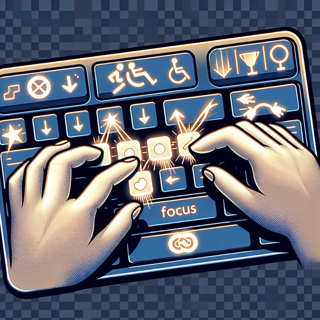
Dragging Movements
On October 5, 2023, the W3C published WCAG 2.2 as an official web standard. While WCAG 2.1 remains valid and widely referenced, WCAG 2.2 introduces nine new success criteria and removes one obsolete requirement. These changes reflect a deeper understanding of mobile accessibility, cognitive disabilities, and focus management.
The Legal Landscape
Adoption of WCAG 2.2 varies by jurisdiction:
Predictable Behavior
You're tabbing through a form, reading field labels before you decide what to enter. You tab into a dropdown menu just to see what options are available. The instant it receives focus - before you've even opened it - the page suddenly redirects to a completely different page. You didn't select anything, didn't press Enter, just tabbed through. Now you're disoriented and have to navigate back to find your place.
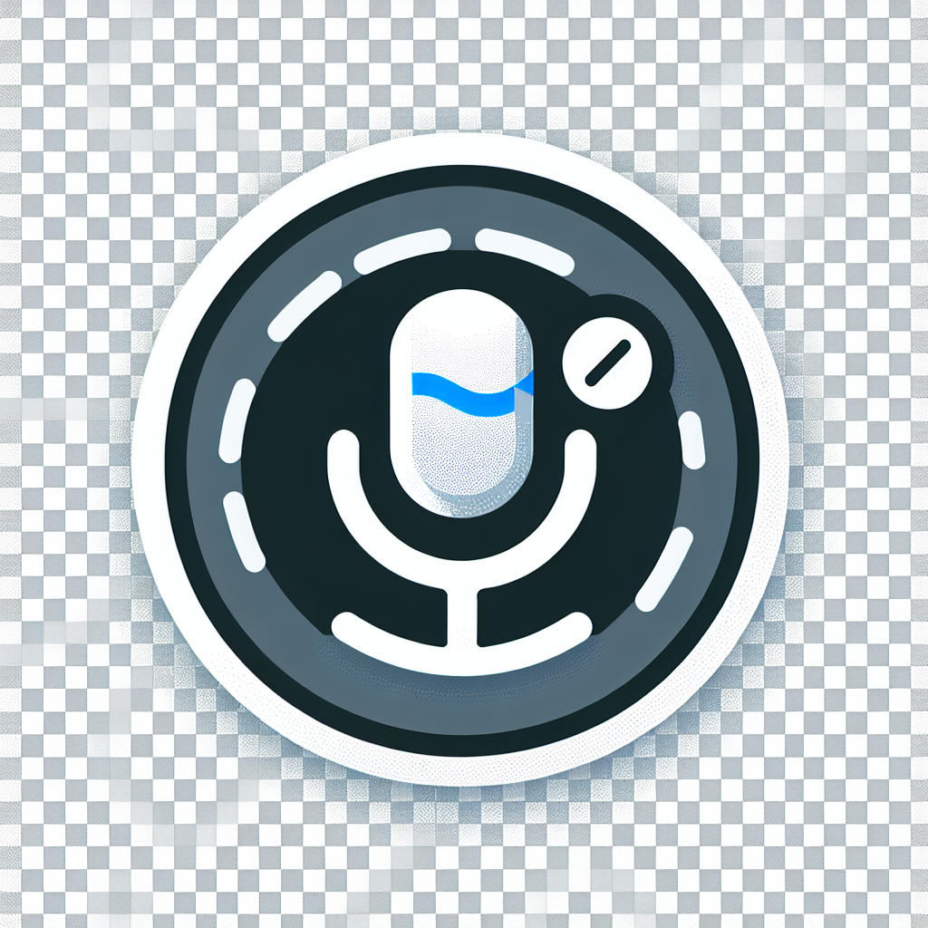
Label in Name
You're using voice control to navigate a website because typing is painful today. You see a button that says "Submit" - perfect, that's what you need. You say clearly: "Click Submit." Nothing happens. You try again: "Click Submit button." Still nothing. Frustrated, you finally say "Show numbers" to overlay numbers on every interactive element, then speak the number to activate the button.

Text Flexibility
You're reading a website, but the text feels cramped. Lines are too close together, making it hard to track from one line to the next. Words blur together. You try increasing your browser's font size, but that only makes part of the problem worse - now the text is bigger but still squished together.
If you could just add a little more space between lines, between words, between letters... you'd be able to read comfortably. But when you try using a browser extension to adjust spacing, the layout breaks. Text gets cut off. Paragraphs overlap. Buttons disappear.

Bypass Blocks
Imagine navigating a website with only your keyboard. You hit Tab to move through interactive elements. First tab: logo link. Second tab: search box. Third tab: first navigation link. Fourth, fifth, sixth tabs: more navigation links. Seventh tab: social media icons. Eighth tab: language selector. Finally, after nine or ten tab presses, you reach the actual content of the page.
Now imagine doing this on every single page you visit. Every. Single. Time.
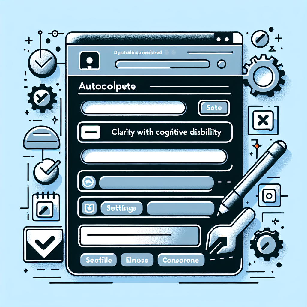
Identify Input Purpose
You're checking out on an e-commerce site for the tenth time this month. You start typing your shipping address... and your browser suggests the wrong address. You're trying to enter your work email, and it keeps suggesting your personal email. You give up and type everything manually, again.
Or maybe you're someone with a cognitive disability who struggles to remember your address. Your browser could help you fill in forms automatically - but only if the website tells the browser what kind of information each field expects.