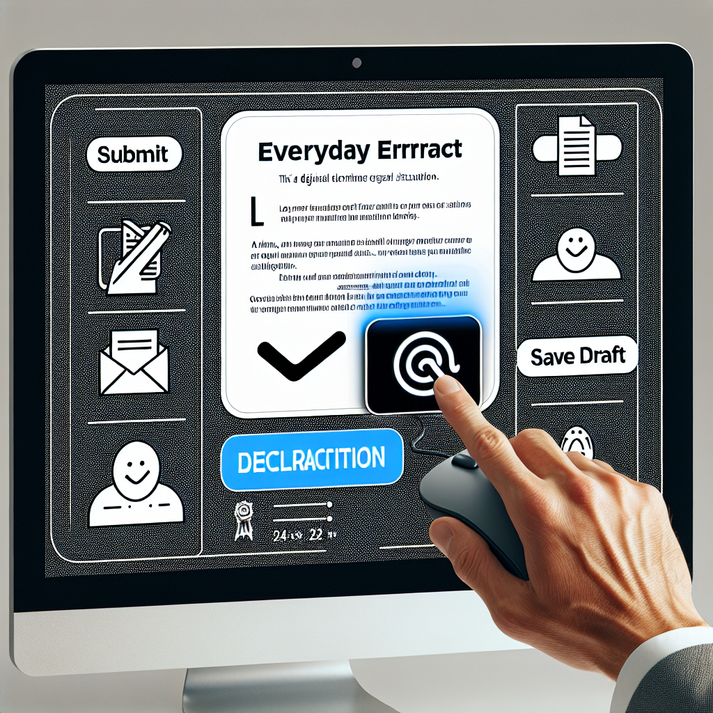
You're filling out a multi-page application form - carefully reviewing each section, gathering documents, double-checking information. Suddenly, a popup appears: "Your session has expired. Please log in again." All your work is gone. You have to start over.
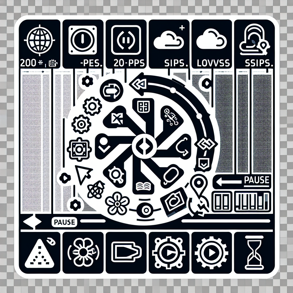
Or you're reading an important article when an auto-playing carousel sweeps the content away before you finish reading it. You try to find the pause button, but there isn't one - the carousel just keeps cycling, forcing you to time your reading to match its pace.