You're checking out on an e-commerce site. You click Submit, and the page reloads with an error message at the top: "There were errors in your submission." That's it. No indication of which fields have problems. No explanation of what's wrong. You start hunting through the form, checking each field, trying to figure out what went wrong.
This frustrating experience is unfortunately common, especially on e-commerce sites, membership portals, and complex forms. But it's also completely avoidable - and fixing it makes your site accessible and more usable for everyone.
The Standards
WCAG 3.3.1 Error Identification - If an input error is automatically detected, the item that is in error is identified and the error is described to the user in text.
WCAG 3.3.3 Error Suggestion - If an input error is automatically detected and suggestions for correction are known, then the suggestions are provided to the user, unless it would jeopardize the security or purpose of the content.
In simple terms: tell users WHAT is wrong (identification) and HOW to fix it (suggestion).
Why Error Messages Matter
Good error messages aren't just about accessibility - they're about conversion rates and user satisfaction. When users can quickly identify and fix errors, they're more likely to complete forms rather than abandoning them in frustration.
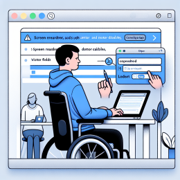
For people with cognitive disabilities, clear error messages are essential - vague errors or confusing instructions can be completely blocking. For screen reader users, errors need to be programmatically associated with the fields that have problems. And for everyone, specific guidance saves time and reduces frustration.
Bad Error Messages vs Good Ones
The Bad: Vague and Unhelpful
- "Invalid input"
- "Error in form"
- "Please correct the errors below"
- "This field is required"
These messages identify that there's a problem but provide no useful guidance.
The Good: Specific and Actionable
- "Email address must include an @ symbol"
- "Password must be at least 8 characters with one number and one special character"
- "Please enter your zip code in the format 12345 or 12345-6789"
- "Credit card number should be 16 digits"
These messages tell users exactly what's wrong and how to fix it.
The Anatomy of Accessible Error Handling
Complete error handling has several components:
1. Error Summary at Top
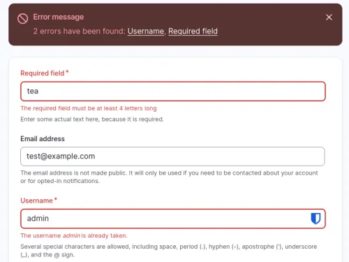
When a form submission fails, provide a summary of all errors at the top of the form with links to each problematic field. This gives users an overview and lets them jump directly to issues.
2. Inline Error Messages
Place error messages next to (or immediately after) the fields with problems. Users shouldn't have to match error messages to fields - the association should be obvious visually and programmatically.
3. Programmatic Association
Use aria-describedby to connect error messages to form fields, and aria-invalid="true" to mark fields with errors. This ensures screen readers announce the error when users focus the field.
4. Visual Indicators
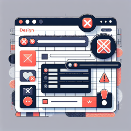
Use multiple visual cues beyond just color: icons, borders, or text labels. Never rely solely on color to indicate errors (remember color-blind users).
5. Preserve User Input
When validation fails, keep the data users already entered. Nothing is more frustrating than having to re-enter everything because one field had an error.
Error Handling in Drupal
Drupal has robust built-in error handling through its Form API, and the Inline Form Errors module (included in core since Drupal 8.5) makes it accessible by default.
What Inline Form Errors Does
When enabled, this core module automatically:
- Places error messages next to the form elements with problems
- Creates a summary of all errors at the top of the form
- Links each error in the summary to its corresponding field
- Adds proper ARIA attributes for screen reader accessibility
- Highlights fields with errors visually
All of this happens automatically for any form built with Drupal's Form API, including Commerce checkout forms, user registration, Webform submissions, and custom forms.
Enabling Inline Form Errors
Simply enable the module at admin/modules. There's minimal configuration needed - it just works. For forms where you need different behavior, you can disable it on a per-form basis using the #disable_inline_form_errors property.
Drupal Form API Error Messages
When building custom forms in Drupal, use the Form API's validation:
Instead of generic "This field is required," provide specific guidance:
- For email: "Please enter a valid email address (example: user@example.com)"
- For phone: "Please enter a phone number in the format (555) 123-4567"
- For dates: "Please enter a date in MM/DD/YYYY format"
The Form API automatically associates these messages with fields and displays them accessibly when Inline Form Errors is enabled.
Commerce and Webform
Both Drupal Commerce and the Webform module integrate seamlessly with Inline Form Errors. Commerce checkout validation errors appear inline next to payment fields, shipping address fields, etc. Webform conditional validation also benefits from proper error placement.
Error Handling in WordPress
WordPress's approach to form errors is... less consistent. The core commenting system has basic error handling, but most forms are built with plugins, and error handling quality varies widely.
The WordPress Form Plugin Landscape
According to accessibility testing by Equalize Digital and Access Armada, most popular WordPress form plugins have significant error handling problems:
- Contact Form 7 - Errors disappear on interaction and fields aren't marked as invalid in the HTML. The free "Contact Form 7: Accessible Defaults" plugin helps but doesn't fix everything.
- Gravity Forms - Generally better accessibility, includes proper ARIA markup and inline errors, but some configuration is needed. Must disable "Legacy HTML" mode.
- WPForms - Basic inline errors but missing some ARIA attributes
- Formidable Forms - Decent accessibility with proper configuration
- Fluent Forms - Mixed results, requires careful testing
Common WordPress Form Problems
- Errors that disappear - Messages vanish on the slightest interaction, before users can read them
- Missing ARIA attributes - Fields aren't marked as invalid, errors aren't associated with fields
- Poor field/label association - Labels not properly connected to inputs
- Validation timing - Some plugins validate on every keystroke (annoying) or read errors while typing in other fields
- Color-only indicators - Red text/borders without icons or text labels
What to Look For
If you're choosing a WordPress form plugin, test error handling specifically:
- Submit a form with errors intentionally
- Do error messages appear next to fields with problems?
- Do the messages stay visible until you fix the issue?
- Use a screen reader - are errors announced when you focus error fields?
- Are fields marked with
aria-invalid="true"? - Is there an error summary at the top with links to problems?
The Gravity Forms plugin (with Legacy HTML disabled) and Formidable Forms generally provide the best accessibility, though both require testing and proper configuration.
When NOT to Provide Suggestions
The standard includes an important exception: don't provide suggestions if it would jeopardize security.
Examples of when to be vague:
- Login forms - Don't say "username not found" vs "wrong password" - both reveal information to attackers. Just say "Invalid username or password."
- Security questions - Don't hint at the correct answer
- Password strength - You can require certain criteria but don't say "you need 2 more special characters" which helps attackers
For most form fields, though, being specific is both more secure and more accessible. Telling someone their credit card number format is wrong doesn't help fraudsters.
Real-Time vs Server-Side Validation
Modern forms often validate as you type (real-time) in addition to server-side validation when you submit. Both have their place:
Real-Time Validation
Can provide immediate feedback: "✓ Email format is valid" or "✗ Password too short." But be careful:
- Don't validate on every keystroke - wait until users leave the field
- Don't announce errors while users are still typing
- Don't clear error messages before users fix the issue
- Make sure success/error indicators are announced to screen readers
Server-Side Validation
Always required as a backup (JavaScript can be disabled or bypassed). When server validation fails:
- Keep all user-entered data
- Show error summary and inline errors
- Move focus to the error summary or first error field
- Use
role="alert"on the error summary for immediate screen reader announcement
Testing Your Error Messages
- Intentionally trigger errors - Leave required fields blank, enter invalid formats, exceed character limits
- Can you identify what's wrong? - Are error messages specific and helpful?
- Check with a screen reader - Are errors announced? Can you navigate between errors?
- Look at the HTML - Are fields marked
aria-invalid="true"? Are errors connected witharia-describedby? - Test on mobile - Can you see both the field and its error without excessive scrolling?
- Try without mouse - Can you reach and understand errors with keyboard only?
The Bottom Line
Good error messages are specific, actionable, and appear right where users need them. They tell people what went wrong and how to fix it. They're programmatically associated with fields so screen readers announce them. And they persist until the problem is actually resolved.
In Drupal, the Inline Form Errors module in core handles most of this automatically - just enable it and write clear error messages in your validation code. In WordPress, you'll need to carefully choose and configure your form plugins, and test thoroughly to ensure errors work accessibly.
Whether you're building an e-commerce checkout, membership registration, or simple contact form, your error handling directly impacts completion rates and user satisfaction. Get this right, and fewer people will abandon your forms in frustration. Get it wrong, and you're leaving money on the table while creating barriers for users who need extra clarity.
The next time you build a form, submit it with intentional errors and see what happens. If you can't immediately identify and fix the problems, your users can't either.











Add new comment