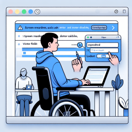
You hover over an icon to see what it does, and a helpful tooltip appears. But before you finish reading it, you accidentally move your mouse slightly and the tooltip vanishes. Or you're using a screen magnifier and the tooltip appears, but it's positioned right under your mouse pointer, making it impossible to read the magnified version. Or you're navigating with a keyboard, the tooltip appears when you tab to a button, but you can't move your mouse over the tooltip text to select and copy it.
These frustrating experiences happen constantly with tooltips, dropdown menus, and popup content. What seems like a helpful addition to the interface becomes a barrier for many users.
The Standard
WCAG 1.4.13 Content on Hover or Focus - Where receiving and then removing pointer hover or keyboard focus triggers additional content to become visible and then hidden, the following are true:
- Dismissible - A mechanism is available to dismiss the additional content without moving pointer hover or keyboard focus, unless the additional content communicates an input error or does not obscure or replace other content
- Hoverable - If pointer hover can trigger the additional content, then the pointer can be moved over the additional content without the additional content disappearing
- Persistent - The additional content remains visible until the hover or focus trigger is removed, the user dismisses it, or its information is no longer valid
In plain English: tooltips and popups need to be easy to dismiss, you should be able to move your mouse over them, and they shouldn't vanish too quickly.
What Content Does This Apply To?
This standard covers any content that appears and disappears based on hover or focus:
- Tooltips - explanatory text that appears when hovering over icons or abbreviated terms
- Dropdown menus - navigation submenus that expand on hover or focus
- Pop-up definitions - term definitions that appear when hovering over specialized vocabulary
- Custom previews - thumbnail previews or additional information that appears on hover
- Contextual help - help text that appears near form fields on focus
It does not apply to:
- Content controlled by the browser itself (like the browser's default title attribute tooltips)
- Content that doesn't obscure other content
- Error messages that need to be shown
The Three Requirements
Dismissible: Give Users an Escape
Users need a way to dismiss tooltips or popups without moving their mouse or focus. Why? Several reasons:
- Screen magnifier users might have the tooltip covering exactly what they're trying to read
- Users with tremors might have difficulty keeping their mouse steady enough to move it away
- Keyboard users need a way to dismiss without tabbing away from what they're focused on
The Escape key is the standard dismissal mechanism. Pressing Escape should close the tooltip or popup without moving focus or affecting anything else on the page.
Hoverable: Let Users Move Over the Content
When you hover over a trigger and additional content appears, you should be able to move your mouse over that content without it disappearing. This is critical for:
- Screen magnifier users who need to pan their magnified view to read the entire tooltip
- Users who want to select text in the tooltip to copy or translate it
- Users with low vision who might move closer to the screen to read
- Anyone who needs to click links within the popup content
The solution is to keep the content visible when hovering over either the trigger element or the content itself. There should be no gap between them (or the gap should be part of the hoverable area).
Persistent: Don't Vanish Too Quickly
Content should remain visible until:
- The user moves hover or focus away from both the trigger and the content
- The user explicitly dismisses it (like pressing Escape)
- The information is no longer valid (like a notification about an action that's completed)
Never use a timeout to automatically hide content after a few seconds. Users read at different speeds, and some need more time than others. People using screen magnifiers might need to scroll around to read a long tooltip, which takes time.
The only exception is when the information becomes invalid - for example, a tooltip that says "Loading..." should disappear when loading completes.
Common Tooltip Problems
The Disappearing Act
The most common problem: tooltips that vanish when you try to interact with them. This usually happens when there's a gap between the trigger and the tooltip, or when the tooltip itself isn't hoverable.
The Escape That Doesn't Work
Many tooltips don't respond to the Escape key at all. This traps keyboard users who can't dismiss the tooltip without tabbing away from what they're trying to use.
The Timing Problem
Some tooltips appear instantly on hover, then disappear after 3 seconds whether you're done reading or not. This creates a frustrating game of re-hovering to keep the content visible.
The Positioning Nightmare
Tooltips that appear directly under the mouse pointer are difficult for screen magnifier users. Position tooltips offset from the trigger element, and make sure they don't appear off-screen or under the cursor.
Dropdown Menu Considerations
Dropdown menus have special challenges because they're both navigation and hoverable content:
- Users should be able to move their mouse diagonally from the trigger to a submenu item without the menu closing
- Keyboard users should be able to navigate with arrow keys, not just Tab
- The menu should stay open when hovering over any part of it, including gaps between items
- Pressing Escape should close the submenu and return focus to the parent menu item
Consider adding a small delay before closing a dropdown (like 300ms) to allow for imprecise mouse movements, but never use a delay for opening - that feels sluggish.
ARIA Roles for Tooltips
Use the role="tooltip" attribute on tooltip content and connect it to its trigger with aria-describedby:
<button aria-describedby="saveTooltip"> <span aria-hidden="true">💾</span> Save </button> <div id="saveTooltip" role="tooltip"> Save your changes (Ctrl+S) </div>
For more complex popup content that's not just a simple tooltip, consider using role="dialog" or role="menu" as appropriate.
Testing Your Hover Content
Here's how to test whether your tooltips and popups meet this standard:
Test Dismissibility
- Hover over or focus on an element that triggers additional content
- Press Escape - does the content disappear without moving focus?
- Try again with keyboard focus - same result?
Test Hoverability
- Hover over a trigger to show content
- Slowly move your mouse toward the content - does it stay visible?
- Move your mouse over different parts of the content - does it remain visible?
- Try to select text in the tooltip - can you?
Test Persistence
- Trigger the content and just wait - does it stay visible?
- Move your mouse slightly while keeping hover - does it flicker or disappear?
- Use a screen magnifier (or browser zoom at 400%) - can you read the entire tooltip?
Better Alternatives to Tooltips
Sometimes the best solution is to avoid hover-triggered content entirely:
- Show the text inline - If the information is important enough for a tooltip, consider just showing it on the page
- Use disclosure widgets - Expandable sections that users click to open are more predictable than hover-triggered content
- Provide a help icon that toggles - Click to show/hide rather than hover
- Use a persistent sidebar - Keep help text visible in a dedicated area
Hover can enhance an experience, but it shouldn't be the only way to access critical information.
The Bottom Line
Tooltips and popup content can provide helpful context, but only if they're implemented in a way that works for everyone. Make sure your hover content is dismissible with Escape, stays visible when users move their mouse over it, and doesn't vanish on a timer. These simple requirements make tooltips usable for people with screen magnifiers, keyboard users, people with motor disabilities, and everyone who just wants to read the tooltip without playing a game of mouse-position-perfect.
Before shipping that next tooltip, test it yourself: Can you dismiss it with Escape? Can you hover over the tooltip text itself? Does it stay visible long enough to read? If the answer to any of these is no, it's time to fix it.


Add new comment