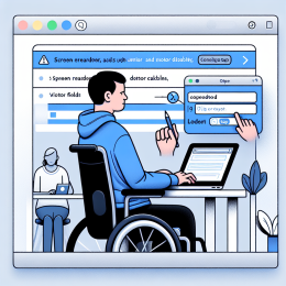
You're using voice control to navigate a website because typing is painful today. You see a button that says "Submit" - perfect, that's what you need. You say clearly: "Click Submit." Nothing happens. You try again: "Click Submit button." Still nothing. Frustrated, you finally say "Show numbers" to overlay numbers on every interactive element, then speak the number to activate the button.
What went wrong? The button visually says "Submit" but the developer added an aria-label that says "Submit this form now" - trying to be helpful. Your voice control software is looking for that longer accessible name, not the visible text. The mismatch means you can't activate the button by saying what you see.
This scenario happens constantly to voice control users, and it's completely avoidable.
The Standard
WCAG 2.5.3 Label in Name (Level A) - For user interface components with labels that include text or images of text, the name contains the text that is presented visually.
In simpler terms: if a button shows "Search," its accessible name must include the word "Search." Users should be able to activate controls by speaking the text they see.
Who Uses Voice Control?
Voice control isn't just for futuristic sci-fi scenarios - millions of people rely on it daily:
- People with motor disabilities - RSI, carpal tunnel, arthritis, tremors, paralysis, amputations - anyone for whom keyboard/mouse use is difficult or impossible
- People with temporary injuries - Broken arms, hand surgery recovery, or any situation where typing hurts
- People multitasking - Cooking while following a recipe online, working hands-free in a workshop
- Power users - Some people simply find voice faster than mouse/keyboard for certain tasks
Common Voice Control Software
- Dragon NaturallySpeaking - The most powerful and established voice control software, used primarily on Windows
- Windows Voice Access - Built into Windows 10/11
- Apple Voice Control - Built into macOS and iOS
- Android Voice Access - Built into Android
- Talon Voice - Cross-platform (Mac, Windows, Linux) voice control primarily aimed at programmers and power users. Works with Dragon or its own built-in speech recognition engine.
- Google Assistant, Siri, Alexa - More limited but increasingly capable
These tools work by matching what users say to the accessible names of on-page elements. When visible labels don't match accessible names, the connection breaks.
How Voice Control Works
Voice control users typically say a command plus a target:
- "Click Submit"
- "Click Search button"
- "Click Home link"
- "Type email address"
The software looks at the accessible name of each interactive element and tries to match what the user said. If a button's visible label is "Submit" but its accessible name is "Complete and submit your application form," most voice software can still match "Submit" - but Apple's Voice Control (at least through iOS 17) cannot.
Best practice is simple: make them match exactly, or at minimum, make sure the accessible name starts with the visible label text.
Common Label in Name Failures
Aria-Label Overrides Visible Text
The most common mistake: adding an aria-label that's different from the visible text:
<!-- Bad: visible and accessible names don't match --> <button aria-label="Submit your application form">Submit</button> <!-- Good: they match --> <button>Submit</button> <!-- Acceptable: accessible name starts with visible text --> <button aria-label="Submit form">Submit</button>
Images with Mismatched Alt Text
Image buttons where the image shows text that doesn't match the alt attribute:
<!-- Bad: image says "Go" but alt says "Search" --> <button> <img src="go-button.png" alt="Search"> </button> <!-- Good: they match --> <button> <img src="go-button.png" alt="Go"> </button>
Icon-Only Buttons
Buttons with only icons need aria-labels, but the label should match what users would naturally say:
<!-- Consider what users will say --> <button aria-label="Close"> <svg>...X icon...</svg> </button> <button aria-label="Menu"> <svg>...hamburger icon...</svg> </button>
For symbolic icons (like X for close, hamburger for menu), the accessible name should be the function, not a description of the icon. Users will say "Click close" not "Click X icon."
Aria-Labelledby Pointing to Wrong Text
Using aria-labelledby to reference text that's different from what's visually associated with the control:
<!-- Bad: button shows "Download" but references different text --> <h2 id="specs">Technical Specifications</h2> <button aria-labelledby="specs">Download</button> <!-- Good: button text matches what it does --> <button>Download</button>
Placeholder as Label
Using placeholder text as the only label fails multiple criteria, including Label in Name, because placeholders disappear when users start typing:
<!-- Bad: no label, only placeholder --> <input type="email" placeholder="Enter your email"> <!-- Good: proper label --> <label for="email">Email Address</label> <input type="email" id="email" placeholder="user@example.com">
When Additional Context Is Needed
Sometimes you want to provide extra context for screen reader users beyond the visible label. The key is ensuring the visible label text appears at the start of the accessible name:
<!-- Good: visible text comes first --> <button aria-label="Search the documentation">Search</button> <!-- Bad: visible text not at start --> <button aria-label="Use this button to search">Search</button>
Better yet, use aria-describedby for additional context instead of aria-label:
<button aria-describedby="search-hint">Search</button> <div id="search-hint" class="visually-hidden"> Search across all documentation </div>
This keeps the accessible name matching the visible label while still providing context.
Symbolic Text and Exceptions
The standard recognizes that some "text" is symbolic rather than literal. For example:
- Rich text editor buttons - "B" for bold, "I" for italics, "ABC" with a checkmark for spell check
- Mathematical symbols - ">" used as an arrow, not as "greater than"
- Decorative characters - Unicode symbols used for visual effect
In these cases, the accessible name should describe the function, not the symbol:
<!-- Text editor button showing "B" --> <button aria-label="Bold">B</button> <!-- Next button showing ">" --> <button aria-label="Next">></button>
Users will say "Click bold" not "Click B" - they understand the symbol represents a function.
Testing Label in Name
With Voice Control
The best test is using actual voice control software:
- Enable voice control (Windows Voice Access, macOS Voice Control, etc.)
- Navigate to your page
- Try to activate buttons and links by saying what you see
- If the visible text is "Submit" and "Click Submit" doesn't work, you have a problem
With Developer Tools
Check accessible names without voice control:
- Open browser developer tools
- Use the Accessibility Inspector (Firefox, Chrome)
- Select an interactive element
- Compare the visible text to the computed accessible name
- The accessible name should contain the visible text, ideally at the start
With Automated Tools
Accessibility testing tools like axe DevTools, WAVE, and Lighthouse flag Label in Name issues, though manual review is still important for context.
Label in Name in Drupal and WordPress
Both CMSs handle this reasonably well if you're using native elements, but problems arise with:
Custom Buttons and Links
When building custom components, avoid overriding visible text with aria-label unless absolutely necessary. If you must add context, make sure the visible text appears first in the accessible name.
Contrib Modules and Plugins
Third-party components might violate this standard. Watch for:
- Modal dialogs with close buttons (does "X" have aria-label="Close"?)
- Sliders and carousels (are next/previous buttons labeled correctly?)
- Custom form widgets (do visible labels match accessible names?)
- Social media buttons (does visible text match aria-label?)
Icon Libraries
When using icon libraries (Font Awesome, Material Icons, etc.), make sure you're adding appropriate text - either visible or via aria-label - that matches what users will say.
The Bottom Line
Label in Name is about trust and predictability. When users see text on a button or link, they expect to be able to speak that text to activate it. Breaking this expectation breaks voice control.
The fix is usually simple: don't override visible text with different accessible names. If you need to add context, put the visible text first in the accessible name, or use aria-describedby instead of aria-label.
Test your site with voice control if you can. If not, at least check accessible names in developer tools to ensure they match what users see. Voice control users rely on this consistency to navigate the web - don't force them to guess or resort to numbered overlays when they can just say what they see.
Make your labels match. Let users say what they see. It's that straightforward.







Add new comment