Picture this: you're reading an article on your phone, or maybe you're at your desktop after a long day of staring at screens. The text is just a bit too small, making your eyes work harder than they should. You zoom in... and suddenly half the content disappears off the side of the screen, or worse - text overlaps and becomes completely unreadable.
This scenario affects millions of people daily - not just those with low vision, but anyone who's adjusted their browser's default font size, anyone using a high-resolution display, or anyone who simply finds small text harder to read as they age (which is most of us eventually).
The Standard
- WCAG 1.4.4 Resize Text - Except for captions and images of text, text can be resized without assistive technology up to 200 percent without loss of content or functionality.
In plain English: users should be able to double the size of text on your site, and everything should still work and be readable.
Why This Matters More Than You Think
Many developers assume that if their site is "responsive," it handles text resizing. But responsive design typically addresses different screen sizes, not text scaling. These are related but different challenges.
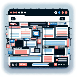
When someone increases their browser's default font size or zooms to 200%, several things can go wrong:
- Fixed-width containers clip text - words get cut off at the edge
- Overlapping content - text flows on top of other elements
- Broken layouts - buttons or form fields become unusable
- Horizontal scrolling - users must scroll both directions to read a sentence
- Hidden navigation - menus disappear or become inaccessible
Common Culprits
Pixel-Based Font Sizes
Using font-size: 14px in your CSS seems straightforward, but it ignores user preferences. When someone has set their browser to use larger text, pixel values don't respect that choice.
Fixed Container Widths
A sidebar set to width: 300px might look perfect at default text sizes, but at 200% zoom, that fixed width can't accommodate the larger text.
Absolute Positioning
Elements positioned with fixed pixel coordinates can overlap when text expands, especially things like dropdown menus, tooltips, or decorative elements.
Images of Text
Logos, buttons, or infographics that contain text as part of an image can't scale the same way live text can. The image might scale, but the text within it becomes pixelated or remains too small.
Best Practices
Use Relative Units
- Use
em,rem, or percentage values for font sizes instead of pixels - A
remunit is relative to the root font size, making it predictable - Example:
font-size: 1.125reminstead offont-size: 18px
Flexible Containers
- Use
max-widthinstead of fixedwidthwhere possible - Let containers grow with their content
- Consider using CSS Grid or Flexbox, which handle content reflow better than older layout methods
Test at Different Zoom Levels
Most browsers let you zoom in several ways:
- Page zoom (Ctrl/Cmd + or -) - scales everything proportionally
- Text-only zoom (in browser settings) - scales just the text
- Browser font size settings - changes the base font size
Your site should work well with all three approaches.
Line Length Considerations
At larger text sizes, line length becomes even more critical. Lines that are too long become difficult to track. The general rule is 50-75 characters per line, which might mean your layout needs to adapt at larger text sizes.
Don't Disable Zoom
Never use <meta name="viewport" content="user-scalable=no"> in your HTML. This prevents users from zooming on mobile devices - a practice that was once common but is now recognized as an accessibility barrier.
Exceptions That Prove the Rule
There are a few legitimate exceptions where text doesn't need to scale:
- Captions and subtitles - these are already designed to be readable at their size and follow different standards
- Images of text - when the image is purely decorative or when the text presentation is essential to the information (like a logo)
- Text that's part of an inactive user interface component
But these exceptions should be rare. In most cases, if you're using an image of text, ask yourself: could this be live text styled with CSS instead?
Testing Your Site
Here's a simple test you can do right now:
- Open your site in a browser
- Press Ctrl/Cmd and + several times to zoom to 200%
- Can you still read all the content?
- Can you still use all the interactive elements?
- Do you need to scroll horizontally to read text?
- Does anything overlap or get cut off?
If you find issues, they're usually fixable with CSS adjustments. The key is building flexibility into your design from the start.
The Bigger Picture
Supporting text resize isn't just about meeting a compliance checkbox - it's about recognizing that your users have diverse needs and preferences. Some people need larger text to read comfortably. Others might zoom in to reduce distractions by focusing on one section at a time.
When you build sites that handle text scaling gracefully, you're not just helping people with low vision - you're creating a more comfortable reading experience for everyone. And as screens get higher resolution and people work longer hours, that flexibility becomes increasingly valuable for all your users.
Make your text scalable, and you make your content accessible to a much wider audience!














Add new comment