You hover over an icon to see what it does, and a helpful tooltip appears. But before you finish reading it, you accidentally move your mouse slightly and the tooltip vanishes. Or you're using a screen magnifier and the tooltip appears, but it's positioned right under your mouse pointer, making it impossible to read the magnified version. Or you're navigating with a keyboard, the tooltip appears when you tab to a button, but you can't move your mouse over the tooltip text to select and copy it.
Design
Labels and Instructions
You've probably encountered this scenario: you land on a form with a single text box. No label, just a placeholder that says "Search..." which disappears the moment you click. Or maybe you've seen a password field that rejected your entry, only to discover afterward that it required at least 12 characters, one uppercase letter, one number, and a special symbol - requirements that were mentioned nowhere near the field itself.
These frustrating experiences aren't just bad design - they're accessibility barriers. And they affect everyone, not just people using assistive technology.
Resize Text
Picture this: you're reading an article on your phone, or maybe you're at your desktop after a long day of staring at screens. The text is just a bit too small, making your eyes work harder than they should. You zoom in... and suddenly half the content disappears off the side of the screen, or worse - text overlaps and becomes completely unreadable.
Focus Order and Visibility
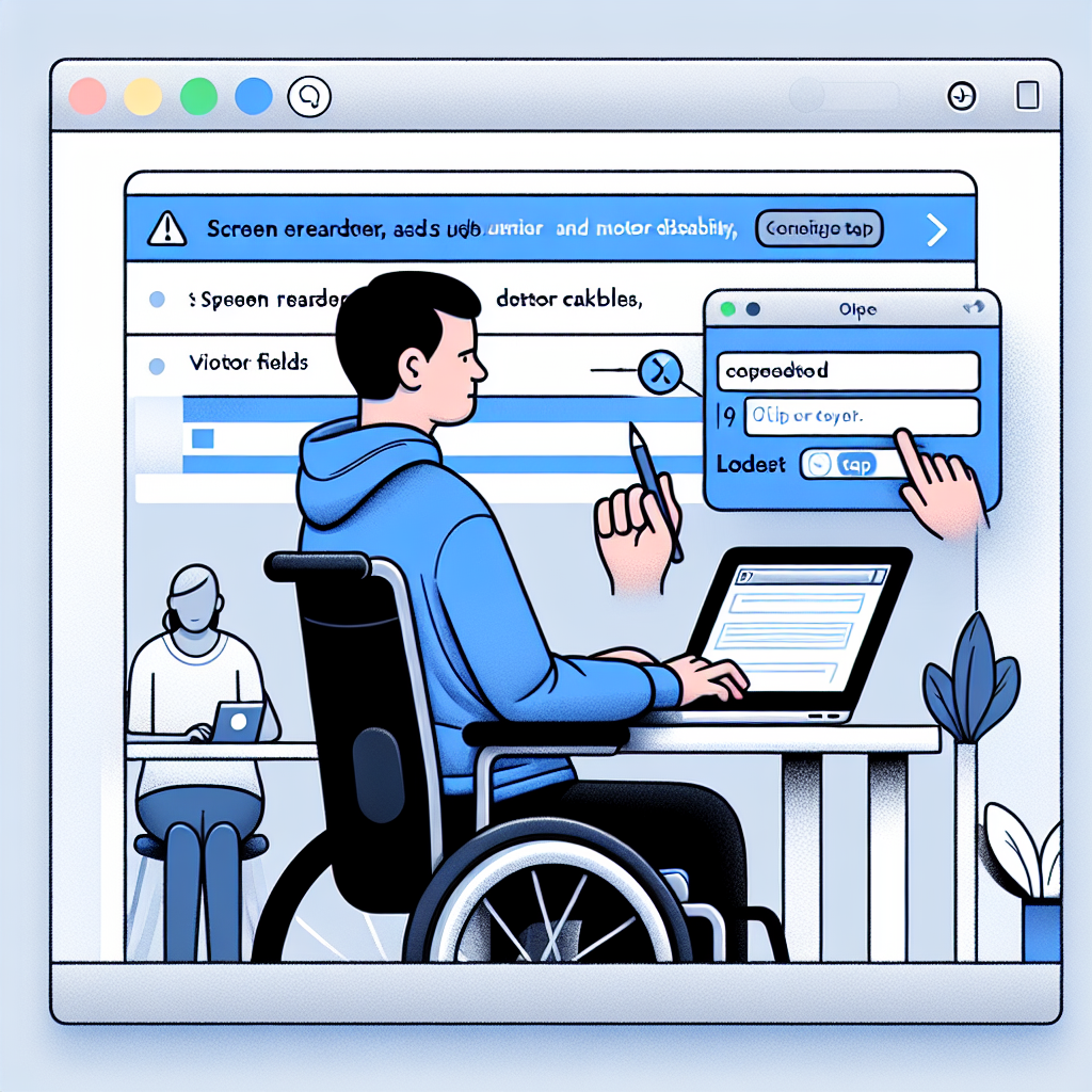
Have you ever tried to fill out a form on a website using only your keyboard? Maybe your mouse died, or you're working on a laptop with a finicky trackpad. You hit Tab to move from field to field, and suddenly you're jumping all over the page, or worse - you have no idea which field you're actually in.
This is the daily reality for many keyboard-only users, including people who use screen readers, people with motor disabilities who rely on keyboard navigation, and power users who simply prefer keyboard shortcuts for efficiency.
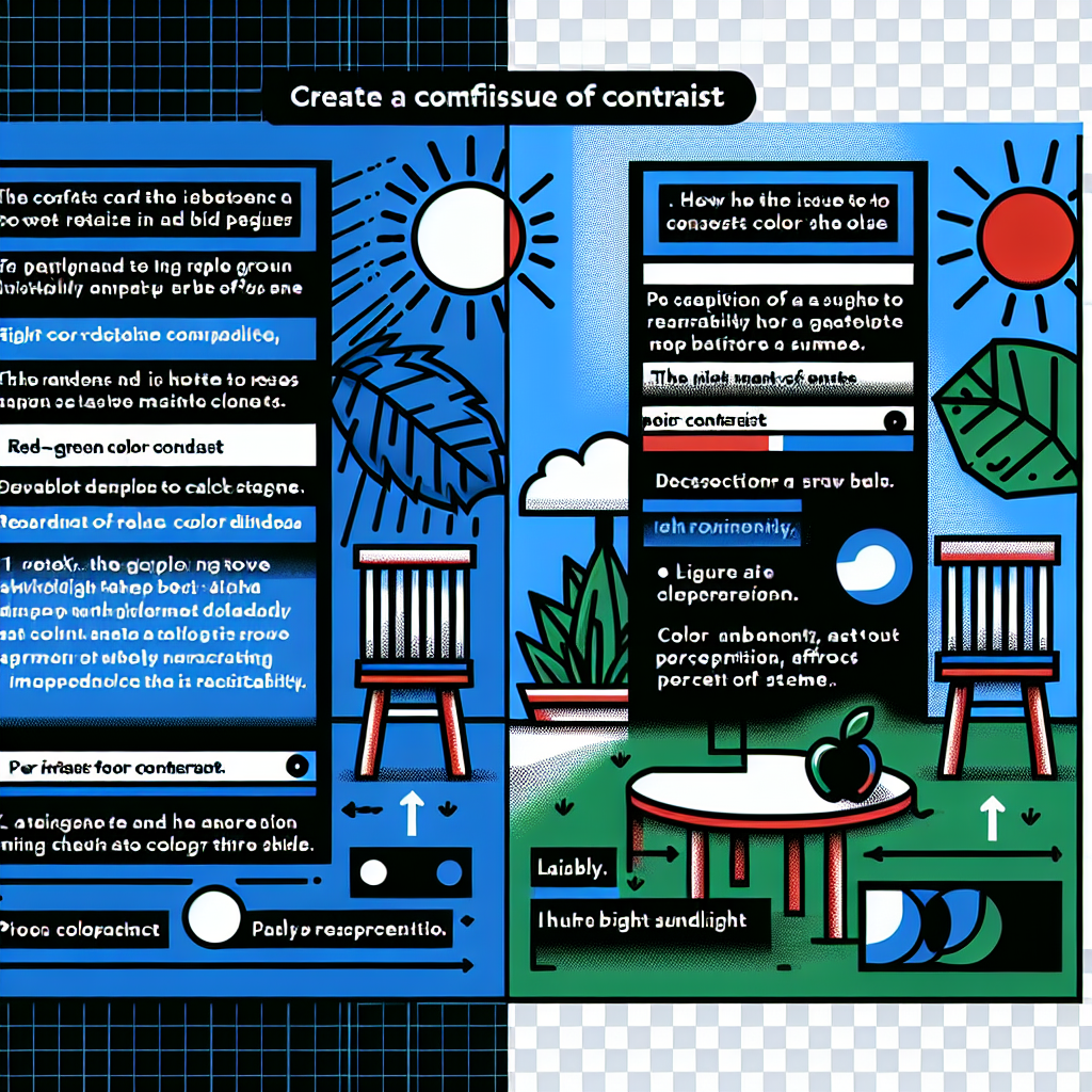
Contrast Issues
One of the most common issues we run into making websites accessible is contrast -- making sure the difference between the color and brightness of the text against the background is enough that it's clearly readable.
Blue text on a dark background can be very difficult to read -- but it's not just brightness. Red-green color-blindness affects around 8% of males around the world. Take a screen out into bright sunlight and try to read text that's similar brightness to its background, and you can start to understand that contrast issues affect everyone.