You've probably encountered this scenario: you land on a form with a single text box. No label, just a placeholder that says "Search..." which disappears the moment you click. Or maybe you've seen a password field that rejected your entry, only to discover afterward that it required at least 12 characters, one uppercase letter, one number, and a special symbol - requirements that were mentioned nowhere near the field itself.
These frustrating experiences aren't just bad design - they're accessibility barriers. And they affect everyone, not just people using assistive technology.
The Standard
WCAG 3.3.2 Labels or Instructions - Labels or instructions are provided when content requires user input.
This seems obvious, but it's violated constantly across the web. Every form field needs a clear label or instruction that tells users what information to enter.
Why Labels Matter So Much
Labels serve multiple critical functions:
- Screen readers announce them - Without a proper label, screen reader users have no idea what a field is for
- They increase the click target - Clicking a label focuses its associated field, making forms easier to use on mobile devices
- They provide context - Users can see what each field is for even after they've started typing
- They persist - Unlike placeholders, labels don't disappear when you focus the field
Labels vs Placeholders: Know the Difference
One of the most common accessibility mistakes is using placeholder text instead of labels. Here's why that's problematic:
Placeholders Disappear
When you click into a field, the placeholder vanishes. If you're filling out a long form and need to review what you've entered, you can't see what each field was asking for. People with cognitive disabilities or memory issues find this especially challenging.
Placeholders Have Poor Contrast
Browsers typically render placeholder text in light gray, which often fails contrast requirements. This makes them difficult to read for people with low vision.
Placeholders Aren't Always Announced
Screen reader support for placeholders is inconsistent. Some announce them, some don't, and some only announce them under certain conditions.
Placeholders Are Confused With Pre-filled Values
Users often mistake placeholder text for values that are already filled in, leading them to skip fields that actually need input.
The Right Way to Use Labels and Placeholders
Always use a proper <label> element. You can also add a placeholder for example formatting, but the label should carry the essential information:
<label for="phone">Phone Number</label> <input type="tel" id="phone" name="phone" placeholder="(555) 123-4567">
The label identifies what the field is for. The placeholder shows the expected format. Both pieces of information remain useful.
Associating Labels with Inputs
The magic happens through the for attribute on the label and the id attribute on the input. They must match exactly:
<label for="email">Email Address</label> <input type="email" id="email" name="email">
You can also wrap the input inside the label, though this is less common:
<label> Email Address <input type="email" name="email"> </label>
Both approaches work, but the explicit for/id association is more flexible for complex layouts.
When You Need Instructions Beyond Labels
Sometimes a simple label isn't enough. You might need to provide:
- Format requirements - "Date of Birth (MM/DD/YYYY)"
- Password requirements - "Must be at least 8 characters with one number"
- Character limits - "Maximum 280 characters"
- Why you're asking - "We'll use this email to send your receipt"
These instructions should appear before or directly with the field, not after it, and not only in error messages. Users need to know the requirements before they start typing.
Using aria-describedby for Instructions
For longer instructions or help text, use aria-describedby to associate the text with the field:
<label for="password">Password</label> <input type="password" id="password" aria-describedby="password-requirements"> <div id="password-requirements"> Must be at least 8 characters and include one number and one special character. </div>
Screen readers will announce both the label and the description when the user focuses the field.
Special Cases and Common Mistakes
Search Boxes
That search box in your header? It needs a label. Even if you don't want to show it visually, you need one for screen readers:
<label for="search" class="visually-hidden">Search</label> <input type="search" id="search" placeholder="Search...">
The visually-hidden class hides the label from sight but keeps it available to screen readers. Most CSS frameworks include this utility class.
Icon-Only Buttons
Buttons with just icons (like a magnifying glass for search or a hamburger menu) need accessible text:
<button aria-label="Search"> <svg>...magnifying glass icon...</svg> </button>
Required Fields
Mark required fields clearly - and not just with color. Use the word "required" or an asterisk with a legend:
<label for="email">Email Address <span aria-label="required">*</span></label> <input type="email" id="email" required>
Or add explanatory text at the top of the form: "Fields marked with * are required."
Groups of Related Fields
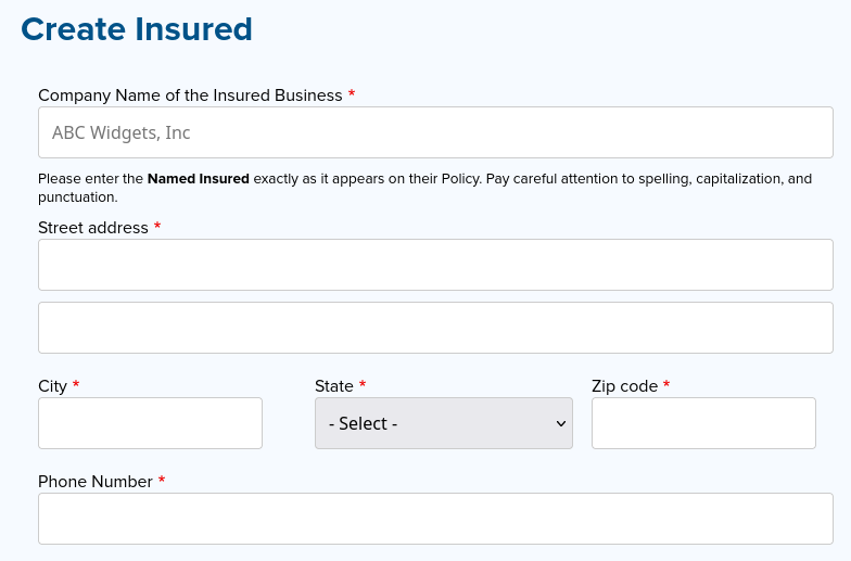
For groups like address fields or credit card information, use <fieldset> and <legend>:
<fieldset> <legend>Shipping Address</legend> <label for="street">Street Address</label> <input type="text" id="street"> <label for="city">City</label> <input type="text" id="city"> <label for="state">State</label> <input type="text" id="state"> </fieldset>
The legend provides context for the entire group, while each field has its own label.
Radio Buttons and Checkboxes
Each radio button or checkbox needs its own label, and the group needs a legend or heading:
<fieldset> <legend>How did you hear about us?</legend> <input type="radio" id="search" name="source" value="search"> <label for="search">Search Engine</label> <input type="radio" id="social" name="source" value="social"> <label for="social">Social Media</label> <input type="radio" id="friend" name="source" value="friend"> <label for="friend">Friend or Colleague</label> </fieldset>
Testing Your Labels
Here are quick ways to test whether your forms have proper labels:
- Click the label text - Does it focus the input? If not, they're not properly associated
- Use a screen reader - Navigate through the form with Tab. Is each field clearly identified?
- Disable CSS - Can you still tell what each field is for? If you relied on placeholders or visual design alone, the form becomes unusable
- Use browser dev tools - The accessibility inspector can show you which form elements lack labels
- Try filling it out on mobile - Without proper labels, small touch targets become frustrating
The Bottom Line
Clear labels and instructions aren't just good for accessibility - they're good for everyone. They reduce errors, improve completion rates, and make forms less frustrating to use. When users know exactly what you're asking for and what format you expect, they can provide it the first time.
Before launching your next form, take a few minutes to review every field. Does it have a clear label? Are the requirements obvious? Would you be able to fill it out with your eyes closed using a screen reader? If not, it's time to add those labels and instructions.

Add new comment