Imagine clicking "Submit" on a legal contract, only to realize you meant to click "Save Draft." Or transferring $1,000 to the wrong account with no confirmation step. Or deleting your entire photo library with a single misclick. These aren't hypothetical scenarios - they happen every day when websites don't implement proper error prevention.
For people with motor disabilities who might accidentally click the wrong button, or people with cognitive disabilities who might not fully understand the consequences of an action, error prevention isn't just a nice-to-have - it's essential. And beyond accessibility, these safeguards also protect against security threats like Cross-Site Request Forgery (CSRF) and Cross-Site Scripting (XSS) attacks, where malicious actors try to trick users into performing actions they didn't intend.
The Standard
WCAG 3.3.4 Error Prevention (Legal, Financial, Data) - For web pages that cause legal commitments or financial transactions for the user to occur, that modify or delete user-controllable data in data storage systems, or that submit user test responses, at least one of the following is true:
- Reversible - Submissions are reversible
- Checked - Data entered by the user is checked for input errors and the user is provided an opportunity to correct them
- Confirmed - A mechanism is available for reviewing, confirming, and correcting information before finalizing the submission
Notice this standard only applies to specific types of actions: legal commitments, financial transactions, data modification/deletion, and test responses. Not every form submission needs these protections - but these critical actions absolutely do.
What Qualifies as Critical?
Legal Commitments
- Signing contracts or agreements
- Accepting terms of service with legal implications
- Submitting legal documents or applications
- Making binding reservations or purchases
Financial Transactions
- Making payments or transfers
- Purchasing products or services
- Changing bank account or payment information
- Authorizing recurring charges
Data Modification or Deletion
- Deleting user accounts
- Removing uploaded files or content
- Clearing saved data
- Changing critical profile information
Test Responses
- Submitting exam answers
- Finalizing quiz or assessment responses
- Any test where the result affects the user's standing
Three Ways to Prevent Errors
The standard gives you three options. You only need to implement one, but many sites use multiple approaches for extra protection.
Option 1: Make It Reversible
Allow users to undo or cancel the action within a reasonable timeframe. Examples:
- Email services - Gmail's "Undo Send" feature gives you a few seconds to cancel
- E-commerce - Allowing order cancellation before shipping
- Trash/Recycle bins - Deleted items go to a temporary location before permanent deletion
- Edit windows - Social media posts can be edited or deleted shortly after posting
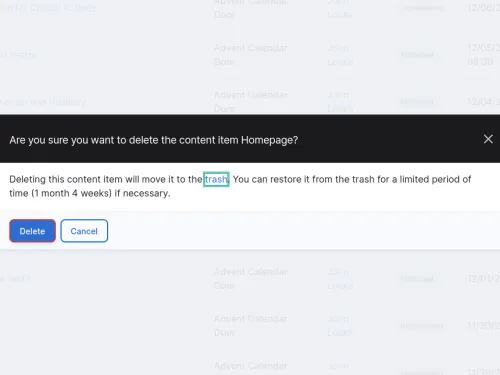
- Content management systems - Drupal's Trash module moves deleted content to a trash bin where it can be restored, rather than permanently deleting it immediately
The key is making the reversal process obvious and accessible. A "restore" link in the same interface is much better than requiring users to contact support.
Option 2: Check for Errors
Validate user input and provide opportunities to correct mistakes before they cause problems. Examples:
- Format validation - Checking that email addresses, phone numbers, or credit card numbers are valid formats
- Logic checks - Warning if a transfer amount exceeds available balance
- Completeness checks - Identifying missing required fields
- Consistency checks - Flagging when entered data doesn't match (like password confirmation fields)
The validation should happen before final submission, with clear error messages that help users fix the problems. Real-time validation as users type can be helpful, but make sure it doesn't interfere with their input process.
Option 3: Require Confirmation
Show users a summary of what they're about to do and require explicit confirmation. This is probably the most common approach. Examples:
- Review screens - E-commerce checkout pages showing order details before final purchase
- Confirmation dialogs - "Are you sure you want to delete this?" popups
- Preview modes - Showing what a published post will look like before making it live
- Summary pages - Forms that show all entered data for review before submission
Error Prevention as Security Defense
Confirmation steps aren't just about preventing honest mistakes - they're a critical defense against malicious attacks:
CSRF Protection
Cross-Site Request Forgery attacks trick users into performing actions on sites where they're authenticated. An attacker might embed a hidden form on their site that, when visited, attempts to delete your account or transfer money. Confirmation steps that require users to explicitly review and approve actions make these attacks much harder to execute - the attacker can't predict or bypass a confirmation dialog that shows specific details.
XSS Mitigation
Cross-Site Scripting attacks inject malicious code that could trigger unwanted actions. A confirmation step that clearly shows what action is about to be performed gives users a chance to spot something suspicious. If a dialog pops up asking "Are you sure you want to delete all your data?" when you didn't intentionally trigger that action, it's a red flag.
Defense in Depth
While confirmation steps shouldn't be your only security measure (you still need CSRF tokens, input validation, and proper authentication), they add a valuable human checkpoint. An attacker might compromise your technical defenses, but getting past a human reviewing a confirmation screen is much harder.
Best Practices for Confirmation
Be Clear About Consequences
Don't just ask "Are you sure?" - explain what will happen:
<div role="alertdialog" aria-labelledby="delete-title" aria-describedby="delete-description"> <h2 id="delete-title">Delete Account?</h2> <p id="delete-description"> This will permanently delete your account and all associated data. This action cannot be undone. </p> <button>Cancel</button> <button>Delete Account</button> </div>
Make the Safe Choice Easy
The "Cancel" or "Go Back" button should be prominent and easy to click. Some designers make destructive actions harder to trigger by:
- Using less prominent button styling for dangerous actions
- Positioning the safe option first or in the primary location
- Requiring users to type a confirmation word for very destructive actions
Don't Over-Confirm
Too many confirmation dialogs train users to click through without reading them. Save confirmations for truly critical actions. Adding an item to a shopping cart? Probably doesn't need confirmation. Deleting your entire cart? Definitely does.
Provide Context
Show users what they're acting on. If they're deleting a file, show the filename. If they're making a payment, show the amount and recipient. Don't make them remember what they just clicked.
What About Regular Forms?
This standard specifically applies to legal, financial, data deletion, and test submissions. Regular contact forms, newsletter signups, or account registration don't strictly require these protections under WCAG AA. However, applying these principles more broadly is still good practice:
- Validate email addresses before submission
- Check for common typos in critical fields
- Show a summary before submitting long forms
- Provide clear success messages so users know their submission worked
Common Mistakes
Confirmation That Doesn't Actually Confirm
Some sites show a confirmation dialog but don't actually show what's being confirmed. "Are you sure you want to proceed?" without any context of what "proceed" means doesn't help prevent errors.
No Way to Go Back
Showing a review page is great, but if users can't easily edit information from that page, you've only partially solved the problem. Each section on the review page should have an "Edit" link that takes users back to that specific part of the form.
Relying Only on Client-Side Validation
JavaScript validation is good for immediate feedback, but always validate on the server too. Users might have JavaScript disabled, or malicious users might try to bypass client-side checks.
Unclear Error Messages
Saying "Invalid input" doesn't help users fix the problem. Be specific: "Email address must include an @ symbol" or "Password must be at least 8 characters."
Testing Your Error Prevention
Walk through your critical user flows and ask:
- What are the most serious mistakes a user could make on this page?
- For financial transactions - is there a review step showing all details before completion?
- For data deletion - can users recover deleted items, or do they get a clear warning?
- For legal commitments - do users see exactly what they're agreeing to?
- Are error messages specific and helpful?
- Can users easily correct mistakes without starting over?
Try having someone else test your flow - especially someone who might be less familiar with the interface. Fresh eyes often catch confusing confirmation messages or missing safeguards.
The Bottom Line
Error prevention is about respecting the consequences of mistakes. A misclick shouldn't cost someone money, lose their data, or commit them to something they didn't intend. By building in reversibility, validation, or confirmation steps, you create a safety net that protects all users - especially those who are most vulnerable to making errors.
Next time you're building a feature that involves money, data deletion, or legal commitments, pause and ask: "What happens if the user makes a mistake here?" Then build in the protections that give them a chance to catch that mistake before it's too late.


Add new comment