Advent 2025 - 24 days of accessibility
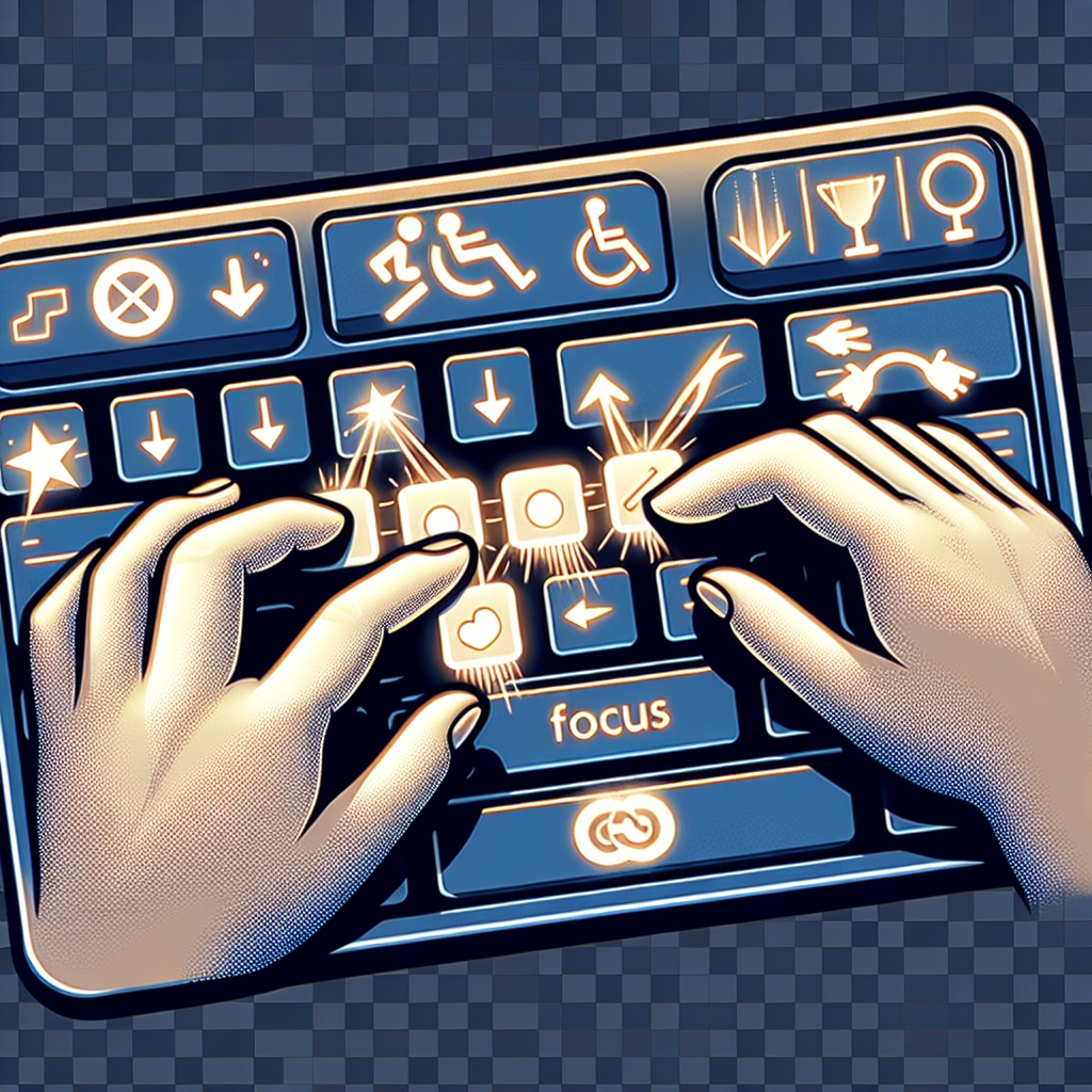
Dragging Movements
On October 5, 2023, the W3C published WCAG 2.2 as an official web standard. While WCAG 2.1 remains valid and widely referenced, WCAG 2.2 introduces nine new success criteria and removes one obsolete requirement. These changes reflect a deeper understanding of mobile accessibility, cognitive disabilities, and focus management.
The Legal Landscape
Adoption of WCAG 2.2 varies by jurisdiction:
Predictable Behavior
You're tabbing through a form, reading field labels before you decide what to enter. You tab into a dropdown menu just to see what options are available. The instant it receives focus - before you've even opened it - the page suddenly redirects to a completely different page. You didn't select anything, didn't press Enter, just tabbed through. Now you're disoriented and have to navigate back to find your place.
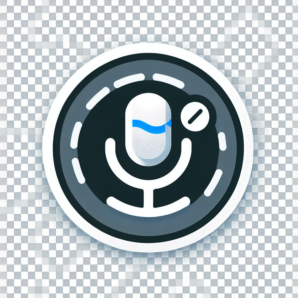
Label in Name
You're using voice control to navigate a website because typing is painful today. You see a button that says "Submit" - perfect, that's what you need. You say clearly: "Click Submit." Nothing happens. You try again: "Click Submit button." Still nothing. Frustrated, you finally say "Show numbers" to overlay numbers on every interactive element, then speak the number to activate the button.
Text Flexibility
You're reading a website, but the text feels cramped. Lines are too close together, making it hard to track from one line to the next. Words blur together. You try increasing your browser's font size, but that only makes part of the problem worse - now the text is bigger but still squished together.
If you could just add a little more space between lines, between words, between letters... you'd be able to read comfortably. But when you try using a browser extension to adjust spacing, the layout breaks. Text gets cut off. Paragraphs overlap. Buttons disappear.
Bypass Blocks
Imagine navigating a website with only your keyboard. You hit Tab to move through interactive elements. First tab: logo link. Second tab: search box. Third tab: first navigation link. Fourth, fifth, sixth tabs: more navigation links. Seventh tab: social media icons. Eighth tab: language selector. Finally, after nine or ten tab presses, you reach the actual content of the page.
Now imagine doing this on every single page you visit. Every. Single. Time.
Identify Input Purpose
You're checking out on an e-commerce site for the tenth time this month. You start typing your shipping address... and your browser suggests the wrong address. You're trying to enter your work email, and it keeps suggesting your personal email. You give up and type everything manually, again.
Or maybe you're someone with a cognitive disability who struggles to remember your address. Your browser could help you fill in forms automatically - but only if the website tells the browser what kind of information each field expects.
Timing Adjustable, Pause, Stop, Hide
You're filling out a multi-page application form - carefully reviewing each section, gathering documents, double-checking information. Suddenly, a popup appears: "Your session has expired. Please log in again." All your work is gone. You have to start over.
Or you're reading an important article when an auto-playing carousel sweeps the content away before you finish reading it. You try to find the pause button, but there isn't one - the carousel just keeps cycling, forcing you to time your reading to match its pace.
Error Identification and Suggestions
You're checking out on an e-commerce site. You click Submit, and the page reloads with an error message at the top: "There were errors in your submission." That's it. No indication of which fields have problems. No explanation of what's wrong. You start hunting through the form, checking each field, trying to figure out what went wrong.
This frustrating experience is unfortunately common, especially on e-commerce sites, membership portals, and complex forms. But it's also completely avoidable - and fixing it makes your site accessible and more usable for everyone.
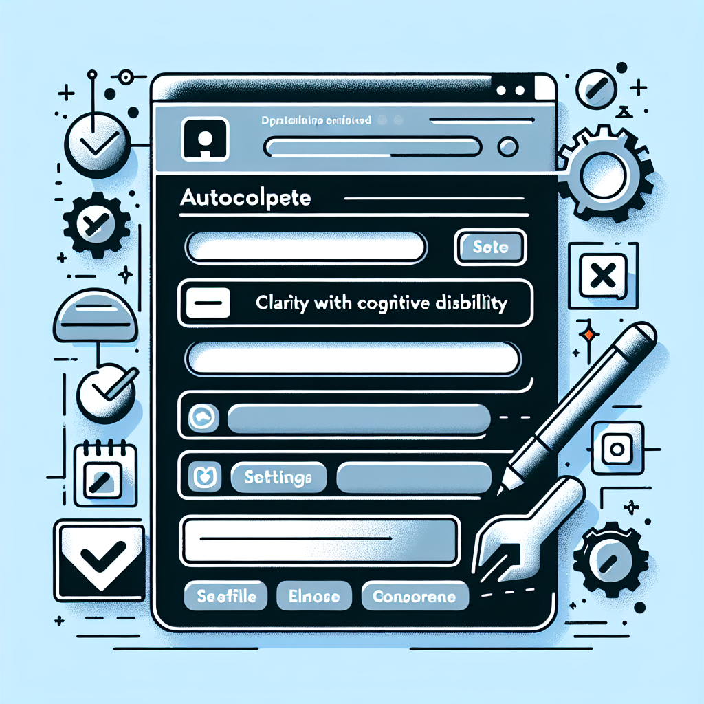
Editoria11y
We've spent the past two weeks discussing accessibility standards - what they mean, why they matter, and how to implement them. But there's a gap between knowing what to do and actually doing it consistently. Content editors add images without alt text. Headings get used for styling instead of structure. Links say "click here" instead of describing their destination.
Info and Relationships
You can make text look like a heading with CSS - increase the font size, make it bold, add some spacing. Visually, it looks perfect. But to a screen reader, it's just regular text. The structure and meaning that's obvious to sighted users is completely lost.
This is the essence of WCAG 1.3.1: information, structure, and relationships that are conveyed through visual presentation must also be available programmatically - in the code itself.
Avoid "Accessibility Widgets"
You've probably seen them: that little circular icon in the bottom corner of a website that opens a menu promising to make the site accessible. Install one line of JavaScript, and your site becomes "100% ADA compliant" and "protected from lawsuits." It sounds too good to be true.
That's because it is.