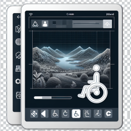
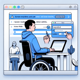
Picture someone with a tablet mounted on their wheelchair in landscape orientation. They navigate to your site, but it forces portrait mode, making it impossible to use without physically rotating their mounted device - something they can't easily do. Or imagine someone with low vision zooming their browser to 400%, only to find they now have to scroll horizontally to read every single line of text.
These aren't edge cases. People with disabilities often have specific reasons for how they orient their devices or how much they zoom. Your site needs to work with their choices, not fight against them.
The Standards
WCAG 1.3.4 Orientation - Content does not restrict its view and operation to a single display orientation, such as portrait or landscape, unless a specific display orientation is essential.
WCAG 1.4.10 Reflow - Content can be presented without loss of information or functionality, and without requiring scrolling in two dimensions for vertical scrolling content at a width equivalent to 320 CSS pixels, or horizontal scrolling content at a height equivalent to 256 CSS pixels.
In plain English: don't force people to use a specific orientation, and make sure your content adapts to narrow viewports without requiring horizontal scrolling.
Why Orientation Matters
People Mount Their Devices
Many people with mobility disabilities mount tablets or phones in a fixed position:
- On a wheelchair in landscape orientation for easier viewing
- On a desk stand at a specific angle
- Using specialized mounting equipment that can't easily rotate
- In vehicles or medical equipment
When a site forces a different orientation, these users face a choice: physically remount their device (often impossible) or abandon your site.
People Have Preferences
Beyond accessibility needs, people simply prefer different orientations for different tasks:
- Reading long articles in portrait (more vertical space)
- Watching videos or viewing images in landscape (wider view)
- Using split-screen multitasking in whatever orientation fits
The Technical Problem
Orientation locking typically happens through CSS or JavaScript that detects device orientation and either refuses to display content or shows a "please rotate your device" message. This is almost never necessary and creates barriers for users who can't or don't want to rotate.
When Is Orientation Locking Okay?
The standard allows orientation locking only when it's essential. Examples of essential orientation:
- A piano app where landscape is required to show enough keys
- A check deposit app where landscape is essential for capturing the check properly
- A projection presentation where the orientation is inherent to the format
But these cases are rare. Most content works fine in both orientations with proper responsive design.
Why Reflow Matters
Zoom Is Critical for Low Vision
People with low vision often zoom their browser to 200%, 300%, or even 400% to read comfortably. At 400% zoom, a 1280px wide screen effectively becomes 320px wide - the same as a small phone screen.
If your site requires horizontal scrolling at this width, every line of text becomes a frustrating exercise in scrolling right to continue reading, then scrolling left to start the next line.
Small Screens Are Everywhere
Even without zooming, many devices have narrow screens:
- Older smartphones
- Smartwatches (yes, people browse on them)
- Narrow browser windows on desktop (multitasking)
- Split-screen views
The Two-Dimensional Scrolling Problem
Having to scroll both horizontally and vertically to read content is cognitively demanding. It breaks reading flow, makes it easy to lose your place, and is especially difficult for people with cognitive disabilities or anyone using screen magnification.
What Reflow Means in Practice
At 320px width, your content should:
- Display in a single column without horizontal scrolling
- Keep all text readable without zooming
- Make all interactive elements accessible
- Preserve all functionality (no features hidden or removed)
Exceptions to Reflow
Some content types genuinely require two-dimensional layout:
- Data tables - complex tables often need horizontal scrolling to remain usable
- Images and maps - can require two-dimensional viewing
- Diagrams and charts - where the spatial relationships are essential
- Toolbars - some tool interfaces require horizontal space
- Games - where the layout is part of the gameplay
The key is that the content itself requires the two-dimensional layout, not just your design choices.
Common Reflow Problems
Fixed-Width Containers
Setting containers to fixed pixel widths that are wider than 320px forces horizontal scrolling. Use max-width instead of width, or use flexible units like percentages or viewport widths.
Large Images
Images with fixed widths that exceed the viewport width cause horizontal scrolling. Make images responsive with max-width: 100% and height: auto.
Non-Wrapping Text
Long URLs, code snippets, or text with white-space: nowrap can overflow containers. Use word-wrap: break-word or overflow-wrap: break-word for long strings.
Horizontal Navigation
Desktop navigation menus that work horizontally need to stack vertically or convert to a hamburger menu on narrow screens. The key is making all menu items accessible without horizontal scrolling.
Multi-Column Layouts That Don't Collapse
Sidebars and multi-column layouts need to collapse into a single column at narrow widths. CSS Grid and Flexbox make this easier with properties like grid-template-columns: 1fr in mobile media queries.
Responsive Design Done Right
Both these standards are fundamentally about responsive design - building sites that adapt to different viewing conditions. Here are the key principles:
Mobile-First Approach
Start with the narrow, single-column layout and enhance for wider screens. This ensures your content works at 320px by default.
Flexible Layouts
Use CSS Grid, Flexbox, or percentage-based widths that adapt to available space rather than fixed pixel dimensions.
Responsive Images
Make all images scale down to fit their containers while maintaining aspect ratio. Drupal CMS includes responsive image recipes that handle this automatically - you define a few image styles, and Drupal generates the appropriate sizes and serves the right one based on viewport width. This not only helps with reflow but also improves performance by serving appropriately-sized images to different devices.
Test at Multiple Sizes
Don't just test at common breakpoints. Try your site at 320px width specifically. Zoom your browser to 400% and see what breaks.
If you're using Drupal, the new Drupal Canvas interface makes this easier - it lets you preview your site at different sizes while you're building pages, so you can catch layout issues before publishing. This real-time preview across multiple viewport sizes helps ensure your content looks good everywhere.
Don't Remove Content on Mobile
Hiding features or content on small screens violates the reflow standard. Everything should be accessible, just reorganized or presented differently.
Testing Orientation and Reflow
Test Orientation
- Open your site on a mobile device
- Rotate between portrait and landscape
- Does everything still work in both orientations?
- Do you see any messages asking you to rotate?
- Check your CSS and JavaScript for orientation locks
Test Reflow
- Open your site in a desktop browser
- Resize the browser window to exactly 320px wide (use developer tools for precision)
- Can you read all content without horizontal scrolling?
- Try zooming to 400% - same result?
- Navigate through the entire site - any features broken or inaccessible?
Browser developer tools often have responsive design modes that make this testing easier. Most let you set exact viewport dimensions and test at different zoom levels.
Automated Visual Regression Testing
Manual testing is important, but it's easy to miss problems - especially when making updates to your site. At Freelock, our protection plan includes visual regression testing at four different widths (320px, 768px, 1024px, and 1280px) as part of every release. This automated testing catches layout breaks before they go live, ensuring nothing "blows out" your site during updates.
This kind of testing is especially valuable because a change that looks fine on your desktop might break the mobile layout, or vice versa. Catching these issues before release protects your users and your reputation.
The Viewport Meta Tag
Make sure you have this meta tag in your HTML head:
<meta name="viewport" content="width=device-width, initial-scale=1">
This tells mobile browsers to use the device width as the viewport width and not to zoom out by default. Without it, mobile browsers may display your site at a zoomed-out desktop width.
Never use user-scalable=no or maximum-scale=1 in your viewport tag - this prevents users from zooming, which directly violates accessibility standards.
Modern CSS Makes This Easier
Modern CSS features make orientation and reflow compliance much simpler:
- CSS Grid - with
auto-fitandminmax()creates naturally responsive layouts - Flexbox - with
flex-wrap: wraplets items reflow automatically - Container queries - (newer) let components adapt based on their container size, not just viewport
- Clamp() - creates fluid typography that scales with viewport
These tools make it easier to build sites that naturally adapt rather than requiring extensive media queries for every breakpoint.
The Bottom Line
Orientation and reflow are about respecting user choice and need. Don't force people to rotate their devices. Don't make them scroll horizontally to read your content. Build sites that adapt fluidly to whatever viewport size and orientation people use.
The good news? If you're already doing responsive design well, you're probably close to meeting these standards. The key is testing at the extremes - 320px width and both orientations - to make sure nothing breaks when users need to view your site their way.






Add new comment