
WordPress

Abstract black and white graphic with various icons, gears, and symbols.

Timing Adjustable, Pause, Stop, Hide

You're filling out a multi-page application form - carefully reviewing each section, gathering documents, double-checking information. Suddenly, a popup appears: "Your session has expired. Please log in again." All your work is gone. You have to start over.

Or you're reading an important article when an auto-playing carousel sweeps the content away before you finish reading it. You try to find the pause button, but there isn't one - the carousel just keeps cycling, forcing you to time your reading to match its pace.

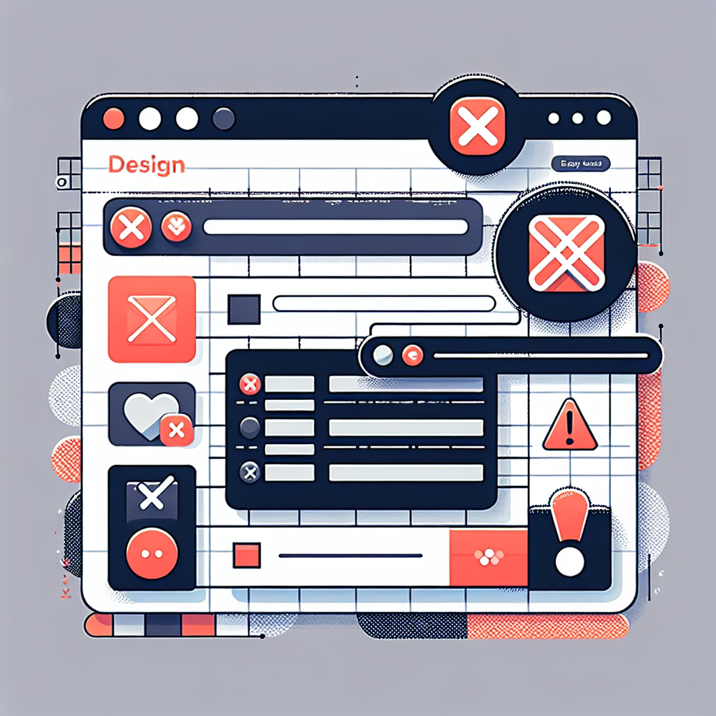
Graphic of a colorful webpage interface with error icons highlighting required fields

Error Identification and Suggestions

You're checking out on an e-commerce site. You click Submit, and the page reloads with an error message at the top: "There were errors in your submission." That's it. No indication of which fields have problems. No explanation of what's wrong. You start hunting through the form, checking each field, trying to figure out what went wrong.

This frustrating experience is unfortunately common, especially on e-commerce sites, membership portals, and complex forms. But it's also completely avoidable - and fixing it makes your site accessible and more usable for everyone.

Graphic of a stylized control panel with blue and black icons.

Editoria11y

We've spent the past two weeks discussing accessibility standards - what they mean, why they matter, and how to implement them. But there's a gap between knowing what to do and actually doing it consistently. Content editors add images without alt text. Headings get used for styling instead of structure. Links say "click here" instead of describing their destination.

Computer setup with code, speakers, and headphones on a wooden desk.

Info and Relationships

You can make text look like a heading with CSS - increase the font size, make it bold, add some spacing. Visually, it looks perfect. But to a screen reader, it's just regular text. The structure and meaning that's obvious to sighted users is completely lost.

This is the essence of WCAG 1.3.1: information, structure, and relationships that are conveyed through visual presentation must also be available programmatically - in the code itself.

Digital accessibility icons with play buttons and tech symbols.

Audio Description (Prerecorded)

I'll be honest: before researching this post, audio description was the accessibility standard I knew the least about. I understood captions for deaf users - that's straightforward. But audio description? I knew it existed, but had never actually implemented it or really understood when it was necessary.

Colorful infographic with various data charts and icons.

Non-text Content

If you know anything about web accessibility, you probably know about alt text. It's the most widely recognized accessibility technique - that little text description you add to images so screen readers can announce what the image shows. But there's more to non-text content accessibility than just slapping some alt text on every image and calling it done.

Let's dig into what you might not know about making images, icons, charts, and other non-text content accessible.

Cliff person smile Drupal  jousting
🕑Jan 17, 2025 🖋John Locke 💬0

Drupal CMS: Making the easy stuff easy

In the past couple days I've gotten two different questions regarding building functionality out in WordPress. This seems a bit...weird with timing, given that Drupal CMS just launched three days ago!

cat with spreadsheet
🕑Feb 27, 2020 🖋John Locke 💬3

WordPress vs Drupal is like Word vs Excel

Seems like every day this month I've answered the same question: Why should I use Drupal instead of WordPress? And this is the answer I've come up with. They are entirely different applications, about as different as Microsoft Word is from Microsoft Excel.